Inspector Panels
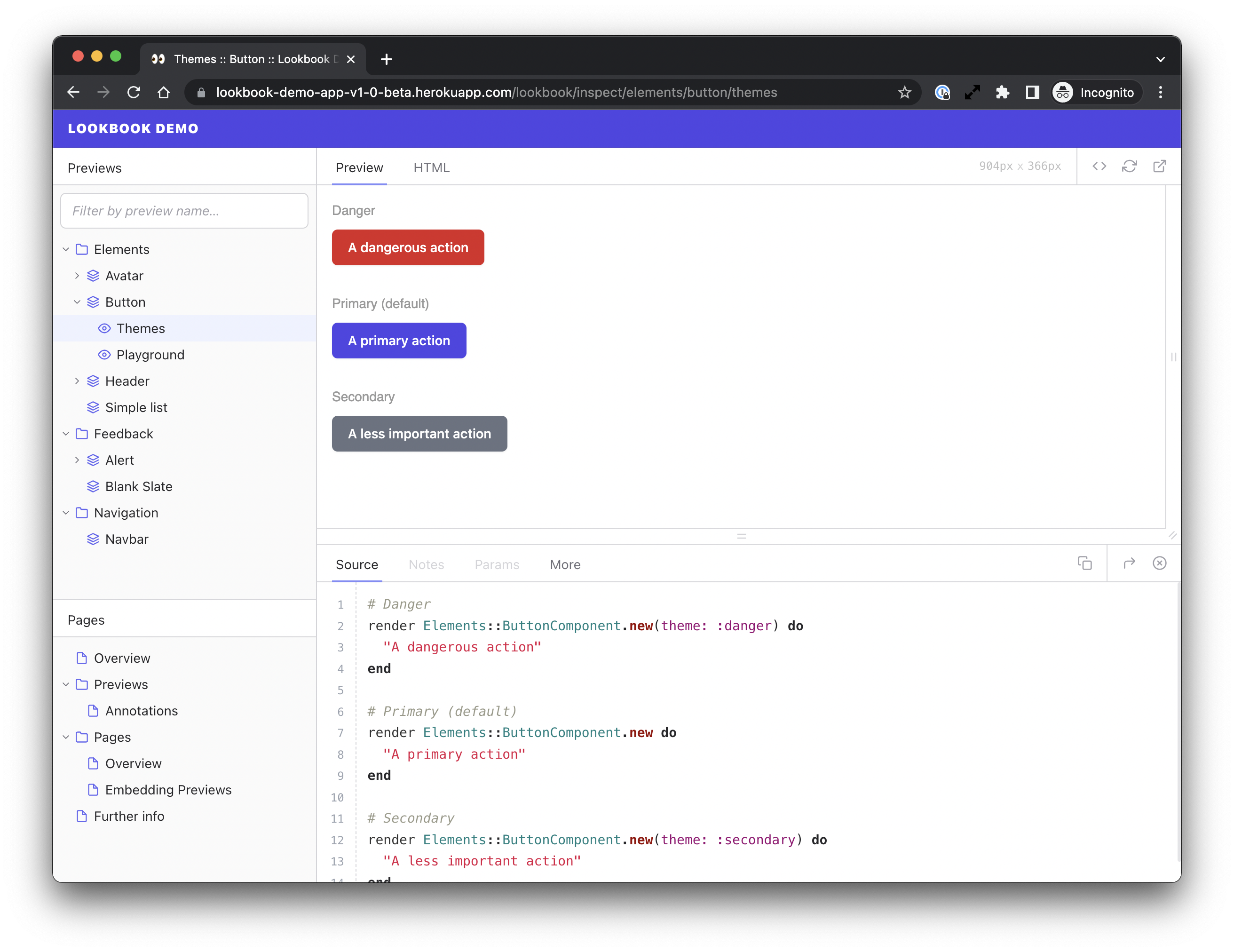
The Lookbook preview inspector is where each preview is rendered alongside its source code, notes and more.
The inspector is made up of a number of tabbed panels, grouped into two areas - the preview area at the top (with Preview and HTML tabs) and the drawer area at the bottom (with Source, Notes, and Params tabs).
It is possible to add custom tab panels into the drawer area, as well as to hide, reposition or reorder the system-provided panels.
Adding a custom panel
You can add a custom inspector panel using the Lookbook.define_panel method when you configure your Lookbook installation:
Lookbook.define_panel(<name>, <partial_path>, <opts?>)
| <name> | A unique name for the panel |
| <partial_path> | Path to the partial template used to render the panel |
| <opts?> | Optional |
For example, a very simple ‘info’ panel could be created as follows:
# config/application.rb
Lookbook.define_panel(:info, "panels/info", {
  label: "Extra Info"
})
<!-- app/views/panels/_info.html.erb -->
<div class="lookbook-panel">
  <h2>Some information</h2>
  <ul>
    <li>You are looking at the '<%= preview.label %>' preview</li>
    <li>The preview file path is: '<%= preview.full_path %>'<li>
    <li>There are <%= examples.size %> examples in this preview<li>
  </ul>
</div>
Panel partial templates can be located anywhere within your app’s views directory.
Panel options
There are a number of available options when defining a panel.
| label | The text to be displayed in the tab for the panel |
| hotkey | keyboard shortcut to make panel become the active tab |
| disabled | Disabled tabs are still accessible but are greyed out in the UI |
| show | Whether or not to display the tab/panel |
| copy | If present, the panel will display a copy button that copies the value of this property to the clipboard when clicked |
| position | Position of the tab in the tab list |
| locals | A |
Lookbook.define_panel(:info, "path/to/view_partial", {
  label: "New Panel",
  position: 1,
  hotkey: "ctrl.n",
  disabled: false,
  show: true,
  copy: "Content to be copied",
  locals: {
    last_updated: '2022-03-02'
  }
})
All panel option values can be provided either as a simple static value or as a lambda function. Lambdas receive a single object with data relating to the currently active preview/example. For example:
{
  label: "Params",
  disabled: ->(data) { data.context.params.none? } # grey out the Params tab if no params are set for the current preview
}
The data hash provided as the single argument to any lambda functions contains the same set of objects that are provided to the panel partial template (see below for full details):
| data.preview | Preview object representing the current preview |
| data.examples | Array of rendered examples that are present in the current preview |
| data.context | Data about the request context |
| data.app | The main Lookbook |
Panel templates
Panel template files are just regular ERB partials. Unlike pages they are not additionally parsed as markdown.
To match the padding and styles of the system panels you should ensure your panel’s content is in an element with the .lookbook-panel class applied to it.
<div class="lookbook-panel">
  <!-- your panel content here -->
</div>
Each panel is has access to a number of variables and helpers that can be used to build dynamic content.
Variables
Any locals defined in the panel options will be available, plus the following:
panel
The resolved panel options object (see above for details)
<p>
  This <%= panel.label %> panel can be switched
  to using the keyboard shortcut <%= panel.hotkey %>
</p>
preview
A preview object representing the current preview.
<h2>This is the <%= preview.label %> preview</h2>
target
An object representing the example or group of examples currently being rendered
<h2>Currently rendering '<%= target.label %>' which is <%= "not" unless target.type == :group %> a group.</h2>
examples
An array of rendered example objects representing the individual examples rendered in the current preview. For non-grouped (i.e. regular) previews, this array will always only have one item.
<p>This preview is showing <%= examples.size %> examples rendered together.</p>
<p>Here is the source code for each example:</p>
<% examples.each do |example| %>
  <div>
    <%= example.source %>
  <div>
<% end %>
context
Request context data
| context.params | Hash of supplied preview parameters, if any |
| context.path | URL path of the current page |
<p>Current URL path: <%= context.path %></p>
data
Shortcut for accessing the Lookbook.data store.
<p>My custom data variable value: <%= data.my_variable %></p>
app
The main Lookbook app instance.
| app.previews | Array of all preview objects |
| app.pages | Array of all page objects |
| app.logger | Lookbook logger instance |
<p>There are <%= app.previews.size %> previews available.</p>
<% app.logger.info("Successfully output the number of previews") %>
Helpers
The following helpers are available in panel templates:
code
Adds syntax highlighting to blocks of code.
The code helper is an alternative to using markdown code blocks for
templates that have markdown parsing disabled, or for when more control is required.
code(<lang?>) { <block_content> }
| <lang?> | The language the code is written in. Defaults to |
<!-- Highlight Ruby code -->
<%= code do %>
  # Ruby code to highlight goes here
<% end %>

<!-- Highlight a different language (HTML) -->
<%= code :html do %>
  <!-- HTML code to highlight goes here -->
<% end %>
icon
Displays an icon.
Lookbook uses icons from the Feather Icons set and a full list of available icon names can be found on that site.
icon(<icon_name>, <opts?>)
| <icon_name> | The name of the icon to display |
| <opts?> | Hash of options |
<%= icon :trash %>
<%= icon :camera, size: 6, style: "color: red;" %>
Styling panel content
If you wish to specify custom CSS rules to style the contents of the panel, just include a <style> element in the panel partial template:
<style>
  h3 {
    color: green;
  }
</style>

<div>
  <h3>My Custom Panel</h3> <!-- will be green -->
  <!-- ... -->
</div>
The <style> element will be removed when the panel is rendered and any styles will be automagically scoped to the panel that they are defined in, so they will not affect other panels or leak out to affect the styling of the UI in general.
Utility classes
There are a number of utility classes available for use in panels to make it easier to match the look and feel of the rest of the Lookbook UI.
| .lookbook-panel | Apply to the panel’s root element |
| .prose | Apply to text content containers. Adds default prose styles to child elements. |
Adding JavaScript
Lookbook uses Alpine JS for its UI, and it is available for use in panel templates too. It’s a great way to add interactivity without ever having to touch a script tag.
For example, to add a button to show/hide a piece of content in the panel, it’s as simple as this:
<div x-data="{ open: false }">
  <button @click="open = !open">Show/hide content</button>
  <div x-show="open">
    Some content here
  </div>
</div>
Check out the Alpine JS documentation for more information.
Because of the way that new content is loaded in to the UI when navigation occurs, adding arbitrary JavaScript in a script tag within
the panel template may not always work as expected, so it is recommended to use Alpine for adding interactivity where required.
Editing system panels
It is possible to edit, reorder or remove any of the system-provided panels, if required. The following panels are provided by Lookbook:
| :preview | Renders the preview in a resizable container |
| :output | The rendered preview HTML source code |
| :source | The preview example method source code (or preview template source, if using) |
| :notes | Preview notes panel |
| :params | Inputs and controls for dynamic preview parameters |
Removing a panel
To remove a panel from the UI entirely you can use the Lookbook.remove_panel method.
Lookbook.remove_panel(<name>)
| <name> | The name of the panel to remove (see above for a list of valid panel names) |
Lookbook.remove_panel(:notes) # Notes panel will not appear in the UI
Editing panel properties
If you want to tweak any properties of a system-defined panel, you can do so using the Lookbook.amend_panel method.
Lookbook.amend_panel(<name>, <opts>)
| <name> | The name of the panel to edit (see above for a list of valid panel names) |
| <opts> | A |
Lookbook.amend_panel(:params, {
  label: "Knobs", # change the tab text
  hotkey: "ctrl.k", # override hotkey
  position: 1 # move to first position in the tab list
})